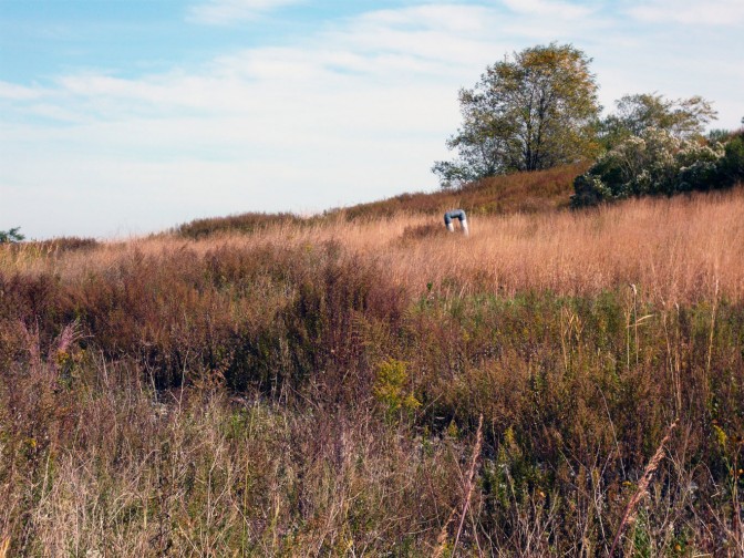
Blog à blog: critique of the Freshkills Park design
Just found this on Where: a critical response to the Freshkills Park plan prompted by last November’s New York Magazine feature. The thrust of the critique is that the Field Operations’ design of Freshkills Park will create a landscape that can be falsely “consumed without guilt:”
All the capping and veiling and the sealing tight are carried out not only to elude dealing with material run-off of the waste, but also to distract from what that waste means and implies and reflects (the architects and the city want to avoid any leaks, physical or moral).
While we don’t speak for Field Operations, we think it would be a shame to lose scope of the site’s historic role in the city’s waste chain. Capping the landfill is not an aesthetic or moral choice–it’s federally mandated–but we have chosen for our arts and educational programming to give due attention to landfilling and waste management. So will future arts and educational facilities on site and interpretive signage. A park, after all, is defined by more than its design or its designers.
Even considering the landscape apart from its programming, it would be difficult to suppress the site’s identity given the inherent unnatural topography of four enormous landfill mounds and the ongoing, long-term monitoring and maintenance of on-site Sanitation infrastructure like landfill gas wells, gas flare stations and landfill byproduct processing facilities. There are the views, too: from atop those elegantly designed 150- to 200-foot mounds, park visitors will have bird’s-eye vistas of the Staten Island Waste Transfer Station, the Fresh Kills Compost Facility and the DSNY Crushing and Screening Facility, all situated adjacent to the park for the foreseeable future. Not to mention Carteret, NJ’s tank farms dotting the shore of the very industrial Arthur Kill. There’s no ignoring the context in which Freshkills Park is situated and the significance of the site in that context.
The critique sets up a dichotomy between making a place better and learning from it, but we think the Field Operations design allows for both. It lets the public feel comfortable entering this space that was once a source of shame and experiencing the scope–and the grandeur–of a site they’ve helped to create, but until now have been unable to see or even conceptualize. This is our opinion, anyway, but we’re biased. There’s been a bit of dialogue about this issue already. What do you think?


